RESPONSIVE E-COMMERCE WEB DESIGN - McLENDON HARDWARE
RESEARCH
Following the completion of the site wireframes and other UX evaluations, it was time to start the process of laying down design for each page. To start this, research was required to understand our audience, our company history and the marketplace.
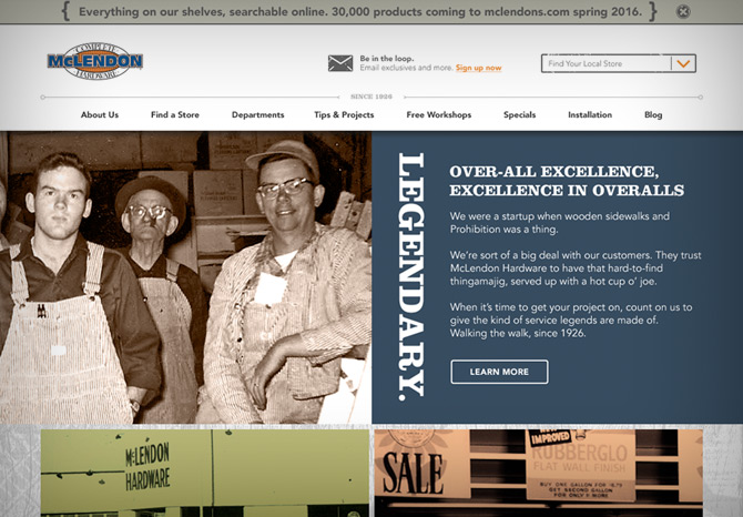
COMPANY HISTORY: My team and I spent a week sorting through archives of old photographs and documents going back 90 years. We also conducted interviews of employees who had been in the company for many years, from which we were able to gain a sense of what the company stood for in their experience. We found a treasure trove of content which would become the theme and voice of the website and marketing going forward.
MARKETPLACE: The easy thing to do here would be to look at who our direct competition was (Home Depot and Lowe's), but in addition to this, we decided to expand our search to smaller companies as well in order to gain a better sense of why they were successful in competition with the same big box stores. What we found was that to be competitive you had to offer more than just more products and better prices. The thing that would make McLendon Hardware great and keep the customers coming back was a better custoemr expercience both in store and online. We also looked to some companies we knew were leaders in the e-commerce industry that we could learn from even through they were outside our industry. For example, Best Buy has a product compare feature that works really well, and Target has had great success with its weekly print ads featured on its website.
CONCEPT
In order to translate all that we had gained in the research process, my team and I decided to create theme boards. This sample of the information would be used to guide us in the site's look, feel and voice.
PRODUCTION
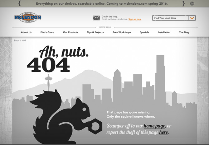
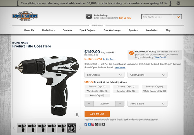
Production began by establishing the look for the outer shell of the website. These components included the header, footer, navegation and icons. In addition, I had to keep in mind that these components needed to translate across viewports and adhere to the wireframe.
Here is an example of the icon set and repeated design elements for this site.


